← Back to the studio


Project
Pole Bank
Fintech brand, name, logo and universe.
The project
A project born from a LinkedIn poll. The community chose the type of brand to create, and fintech won.
The name
Pole Bank evokes poles and banking, in two simple syllables, easy to remember in all languages. Polar was also considered, but Pole Bank was selected.
The polar bear
It embodies quiet strength, protection and trust.
A committed bank
Pole Bank is committed to protecting the poles, endangered species and living beings. The slogan For a cooler planet. plays on the double meaning of "cool", a bank that seems cool and that participates in the fight against global warming.
The logo
Two options were explored, a rounded bear and a geometric bear. The geometric version was selected, more assertive and more modern.
Colors and typography
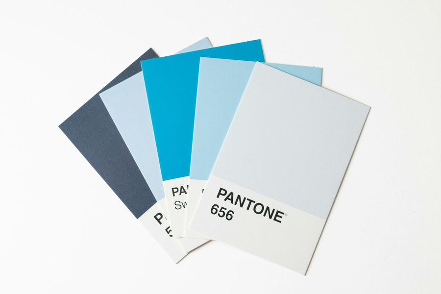
Three colors, midnight blue, ice white and sea green, reserved for the slogan For a cooler planet. The typography is Be Vietnam Pro, in Regular for the name and in Light for the slogan.
Personal project, fictional brand.
Let's talk about your project
Access the form